22.7.13
Updike's Fifth Champion of Typography
Here are the business details on the new book: it's 30 numbered copies, 20 with 15 paper samples and ten with an extra seven samples. See details for the boosted copies back here.
Copies 1 - 10 (with the extra seven samples) will be in full leather, embellished with gilt as the spirit strikes Claudia when she gets into it. PLEASE NOTE: these copies are fully subscribed.
Copies 11 - 30 will be in a quarter leather binding with the leather extending in a thin strip along the upper and lower edges of the boards, and the boards covered in hand-marbled papers (not all the same pattern). A millimeter-style binding. Ten of these copies remain available as of 24.07.13.
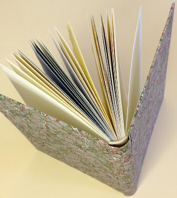
And just to help you imagine how fantastic the bindings will be, up above is the sad-sack copy made up from waste sheets that we (HM) did for our studio copy. Rest assured that Claudia's bindings will look nothing like what you see here.
Copies of the book should be ready for shipping by the end of August. If you're interested, contact one of the booksellers listed opposite; as usual, they get first dibs on new publications from HM, and the edition pretty much looks to be fully subscribed.
It occurred that posting the extract from Updike's essay that we've printed in the book might help explain the concept, so here it is, taken from ‘The Seven Champions of Typography’ (In the Day’s Work, Harvard University Press, 1924):
"Though ink must be black, paper should not always be white. The somewhat irregular Caslon type (and some ‘period’ and transitional types) appears much more agreeably when printed on a slightly rough paper of a cream tint. Caslon’s types in his day were printed on wet paper, which thickened their lines and roughened the paper, so that we get more nearly the effect that he meant them to have when we print them on toned, rough paper. If smooth white paper is used for old style types, it exposes their slight crudities of form in a disagreeable way, & accents too much the shape of individual letters. This is understood by some typefounders, who for that reason often display their old style types on toned paper. Many people prefer a smooth and pure white paper (or think they do) because they look at the paper alone, and do not realize that its color makes any difference in the effect of printing. Some of the lighter modern-faced types look well on a paper that is nearly white; for they are more clean cut, more regular in shape, and have not the irregularities which such a paper reveals. For these types the paper should look white. There are, fortunately, few absolutely white printing papers."


