1.3.24

Dunwich Report No. 1


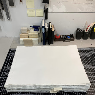
Printing The Dunwich Horror is underway, one sheet down, 12 more plus a few extras (incl. a prospectus) to go. I’m printing two up = two pages on each side of a sheet, folded to make 4 pages. Two sheets to each section. I can work off one side of a sheet in a day, so a sheet takes two days to complete. Unless there’s a second color, which adds a third day. I need to maintain some routine to life, so one-color sheets will get printed Monday/Tuesday, two-color sheets on Thursday/Friday/Saturday. Wednesday and Sunday are resupply days (groceries, wine), plus an hour to dampen the paper for the next day’s run. 


The paper is laid: I have to keep track of rough and smooth sides, so that verso and recto of each opening match (and thus alternate through the book, smooth/rough/smooth etc etc). Luckily the Hayle paper I’m using has two watermarks that make it easy. 
 
 
Winter in Vancouver is a good time for printing, it’s easy to keep the sheets damp. My system involves simply keeping the two stacks of paper - to be print & printed - under very thick cotton towels that have been soaked and thoroughly wrung out. They get spritzed with water a few times during the day, if & as required. Overnight the stack simply stays wrapped in a towel and put in a contractor-grade (= thick) garbage bag. 


I heard second-hand that Jim Rimmer counselled starting a new book somewhere in the middle, to bury any initial hiccups. I always start with the center opening from a section: since the two pages will be facing each other, it’s a good place to establish your color (impression, inking) for the project. 

Briony’s well into making sketches for her aquatints, but we’re not sharing those, at least not for now. (The image at top is an old plate, a test of paper to be used for covering the boards.)

The dunwich.ca site will be updated later this month with all the project details. Unlike previous HM books, this one will be available for direct reservation and purchase, and there will be a pre-publication discount.

Above is one of the book
s eight tailpieces concocted from Bodoni ornaments. These will be printed in bronze (how I will be spending my Saturdays).
1.2.24

A Dunwich Horror


The next project in the press is set, and the really exciting news is that its another collaboration with Briony Morrow-Cribbs, our first since Iskandariya. It will be Lovecrafts The Dunwich Horror, featuring full-page aquatints by Briony. And because it ties in with the story, HPLs brief Chronology of the Necronomicon will be included as an appendix.


After publishing Shadow Over Innsmouth in 2005, every year a few people ask if HM will do another Lovecraft story. Innsmouth only happened because I’d recently become friends with David Clifford, who ran a boutique letterpress shop in town, doing the usual kind of ephemeral and commercial printing. He said if ever I had an idea for a book project that we could collaborate on, he’d be interested in doing something more substantial. I’d already been playing with ideas for Innsmouth, and commissioned wood engravings by Shinsuke Minegishi for a trial edition (above, 2002). The text was longer than I felt I could attack with the handpress at that time, so I suggested we do an edition of 200 copies that would be reasonably priced, with a handful that would be more luxe, along the lines of what I was producing (or trying to) at my studio. David was up for it and it was Game On. 


The Batrachian copies were modelled in format on the 1936 original, combined with Library of America books: simple, elegant hardcovers. The luxe Ichthyan copies were printed on better paper, included actual prints from Shin’s engravings (the ones printed with the text are polymer reproductions), and an elaborate limp vellum-style binding. But all the printing was by David (who used a Heidelberg), so it wasn’t entirely, or purely, a HM book. At the time I’d already identified The Dunwich Horror as a possible follow-up. The bibliographic part of the plot, and the menacing tone appealed. But if I did another Lovecraft I wanted to print it myself, and there were other projects that interested me more.

I’ll do another post about Briony and her work this spring. For now, suffice to say she’s had many personal and professional adventures since we did Iskandariya (she worked on a book edited by Neil Gaiman!). Last year we started swapping emails about finding a new project together. When I pulled out Dunwich and suggested it, I didn’t think it would fly. She hadnt read the story, and I didn’t think it was her kind of thing. So I was surprised when she replied enthusiastically Yes! I was inspired to suggest it after looking over some of her prints and realized one of my long-time favorites, Buzz II (see top), included numerous elements from and allusions to the story. She saw exactly what I meant, and it became the springboard for what will come.
 

Another inspiration was the massive etching Briony created as a jacket for Iskandariya (lots of whippoorwills in the bushes...). 

Which brings us to now. Intaglio is a fussy and time-consuming process. To keep what will already be an expensive book from being prohibitively so, we decided to limit the number of prints in most copies to four. But Briony has ideas for more than four etchings, so we’ve struck upon a plan that will make future cataloguers’ lives a nightmare:
  • Fifteen copies specially bound by Claudia Cohen will contain all seven etchings Briony is creating for this project, a frontispiece and six interior prints. These six prints will be identified by a letter (A – F) in the plate. 
  • The edition’s remaining 35 copies will each contain the frontispiece, and three of the interior prints. But which combination of three will vary from copy to copy (e.g. A, B & C, or B, D & F, etc.), and thus no more than two copies will have the same combination.
We’ve settled on a format (about 7.5 x 10.5 inches, 60-ish pages), and an edition (50 copies issued in two states). The typesetting is nearly complete (following the 1929 Weird Tales original), printing will begin this month. I’ll be using a stash of 1970s-era Barcham Green Hayle paper; I have just enough (see below) for the edition (as long as I don’t screw up...). Briony will print her aquatints on kitikata, the same paper she used for Iskandariya. A few other details are still being hammered out. 

Publication is scheduled for late fall. Future posts this spring will focus on different aspects of the project  the prints, the bindings, etc. – but I’m undecided on how much we’ll share images during production: I like the idea of waiting until it’s completed, presenting the combined result rather than the various parts. We’ll see. Meanwhile, there is a dedicated new site for the project, which will be expanded in about a month’s time. 

1.1.24

Barbara’s Marbles


Byzantiums second publication was issued in late November. I got my Printers Copy. Its a study of how the paper used affects the results when marbling. Octavo in format, 35 leaves from frontis (i.e. the marbled sheet facing the title page) to colophon. The type is Fournier, the paper Arches Text. Before you get excited, its OP. 


The title page was marbled before printing. I was concerned the colors might flow when the sheets were dampened for printing, but she was using acyrilics (and she did a test). 


Barbara made the sections initial letters by laying a “mask” cut to the shape of the letter on the marbled surface, then laying down the sheet. Its amazing what clean edges she achieved.
 

The four samples on this spread were all made by Reg Lissel. The one lower left is part of a leftover from Jim Rimmer’s Duensing Titling (HM 2003).


This spread is from the section on Western mouldmade papers, which Barbara
s deemed the most succussful as a group for marbling. At left is a piece of blue Fabriano Ingres, at right is cream MBM Ingres dArches (plain samples below marbled of each).


Barbara made me sign the colophon. She might have done that once before. I don
t think the printer has any reason to sign but shes just making me feel included.


Claudia bound the books in a russet goat with her glorious tooling. Combining those two materials seamlessly is the kind of subtle and seemingly simple detail that delight the experienced eye. 


A THIS & A THAT
 
Stay tuned for an announcement later this month about HMs next project. A sort-of return/coda to 2005? 
 
The day my copy of Marbled Papers arrived, I also got my personal & unique copy of HM=XX, specially bound in full goat with inlays and tooling, by Claudia Cohen. The box for my copy was a half-inch deeper than the others, to accommodate some extra loose samples.

1.12.23

Santa Better Get It Right This Year!


When I first started printing, for reasons I cannot remember I was under the impression printers typically produced some kind of Christmas/New Year ephemera. Maybe that's because it was 1997 and that was the year I was hanging around Barbarian Press, and they printed a little chapbook to send out to friends and patrons. It was a short poem (I think?) by John Clare, with a wood engraving and a patterned paper wrap. I don't have a copy and I can't find much mention of it online, but maybe that was the seed. 

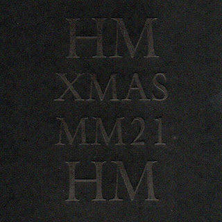
So I ended up doing five or six Christmas “books,” finally stopping when I realized how much work they were, and people didn't really seem to care that much anyway. That up there is the cover to the last one I did, and here's the inside:


It was printed on paper that fell out of an early 17th century book, that I dyed black. 
 

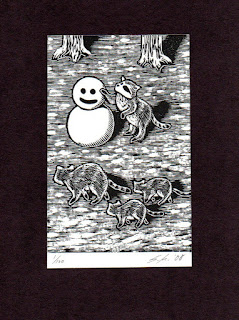
Since before I knew him, the most excellent Shinsuke Minegishi has done a special engraving to mark the start of each new year, all of them including a snowman. One day (soon?) we might publish a collection of them in a book. I have to remember to follow up on that. I have to call Shin too, it
s been a long time. 


Some of the most commonly encountered Christmas keepsakes were produced by A.R. Tommasini, who started his career as a compositor at the University of California Press, and fell into some early renown for setting the original printed version of the U.N. Charter (see here for a few details). His first xmas book was issued in 1948, and he continued until sometime in the ’70s (possibly 1980, the search results are ambiguous), the editions ranging from 50 to over 900 copies. 


All the ones I’ve seen were cased in printed boards, small but not quite miniatures. In 1962 he issued one with linocuts by Vancouvers George Kuthan, with a second (different) edition in 1968.
 

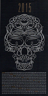
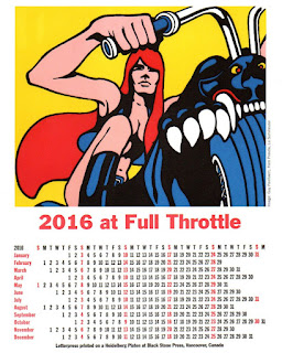
Every year David Clifford’s Black Stone Press (i.e. his kid, Yasmine) would print a calendar to mark the new year; here are a couple...


One of the fun things with books is, you can find a rabbit hole to fall into anywhere you choose to look. Try a few variations of Christmas “private press” keepsake in Abe and see what turns up. J.H. Nash – always on the hunt for rich commissions – printed a bunch. From 1929–1931 Frederic Warde designed at least three xmas books (maybe five? and there’s a ’31 Encschedé version – was he involved with that?) featuring stories by Washington Irving – figure out what all the permutations are and run them down! Or ask Santa to. 


I’m sure there are lots of others out there sharing xmas printing, I’m just not on the mailing list. Which is OK. I enjoy seeing things, I do not need to own a copy. My ongoing battle to winnow things down to a single shelf of non plus ultra continues to make progress, I see victory within a few years. Just don't ask me yet how long the shelf will be...
 
Lately my rabbit holes are all in Japan, and they’re filled with obscure CDs. Merry merry to all. 
 
AND ANOTHER THING!
 
Come back in about two weeks, Ill post some images of Barbara Hodgsons new book about marbling. Copies are shipping next week (its OP).